
Short on time? Download the three-page summary.
Introduction
Investors are grappling with a much more volatile global macro environment than before the pandemic. Unprecedented levels of economic stimulus during COVID, particularly in developed markets, have exacerbated fiscal imbalances that are difficult to adjust. Interest servicing costs in the US are becoming unsustainable, and the leader of the world’s largest economy is now threatening to fire its central bank governor for not cutting rates. A broader regime change in this ‘sacred’ institution is being discussed. Known as ‘fiscal dominance,’ this dynamic threatens to undermine the foundations the modern monetary system is built upon.
These problems are not exclusive to the US, but it is where they are perhaps most acute. There is a path that the US could take which, with a bit of luck, could exit fiscal dominance dynamics. The US administration seems to be cognisant of this narrow path. Against this backdrop, after the most significant sell off in the Greenback since 1973 in H1 2025, investors are finally realising they need more diversified portfolios, ideally in countries whose central banks are not operating under the shadow of rapidly expanding government debt.
The challenge is that strategic asset allocations have been built around market capitalisation indices with survivorship bias, which, when combined with the passive investing trend, has led to extremely concentrated portfolios. This month’s Emerging View offers alternative ways to look at asset allocation across geographies and shows how different portfolios would have performed over the past 30 years.
What a year!
After a rollercoaster ride, US bulls feel vindicated by new record equity market highs. But this euphoria is built on shaky foundations. The S&P 500 is up, in Dollar terms, by 9.1% year-to-date (ytd) (after a 20% drawdown). However, in EUR terms, the US main index is down by 2.2% ytd after a 24% drawdown.
The Dollar de-basement is the main story of the year. The Greenback peaked in Q4 2022 in nominal terms, at 114.8. It had declined just below 100 but then rose back to 110 around President Donald Trump’s inauguration, when most sell-side analysts were claiming tariffs wouldn’t come soon and, if they did, it would be bullish for the Dollar. In the end, the opposite happened.
Tariffs were soon perceived by markets as more negative for US growth than for the rest of the world, and one of various symptoms of US institutional deterioration. The H1 2025 Dollar downturn was the fastest since 1973, but most actual flows were FX hedging or cross-over institutional asset managers reducing exposure. In our opinion, the large rebalancing from long-term investors is yet to come, with most running portfolios that are still extremely concentrated in US assets.
Rethinking asset allocation: How much can investors diversify from US equities?
Most asset allocators have the bulk of their liquid portfolios in fixed income and equity markets. They compare their performance against the large Bloomberg Global Aggregate bond index, and the MSCI World All Countries Index (ACWI) equity index, which includes emerging market (EM) and developed market (DM) countries, or the MSCI World, which doesn’t include EM.
The MSCI ACWI weightings are calculated by the size of the free float market cap of stocks. Elevated valuations, and the fact that American companies typically have higher free floats, means the MSCI ACWI is today composed of 65% US, 15% in DM ex-US, and only 10% in EM.
Simple logic would suggest that a country representing around a quarter of global GDP, and less than 35% of earnings from the ACWI, should not be 65% of your allocation, in our view. This weighting is particularly dangerous today, when US stocks trade at the largest premium to the rest of the world in recent history. It is an aggressive active position in a passive index wrapper.
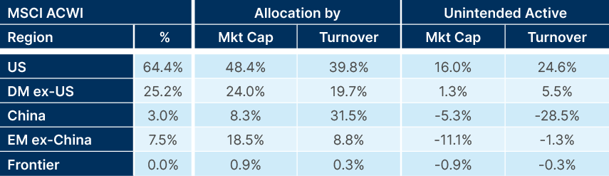
To develop a truly diversified portfolio, investors should be bound not by free float weighted indices, but by the size of each market and its daily traded volumes. Fig. 1 compares the MSCI ACWI allocation per region with the overall market cap and daily turnover. The result demonstrates that investors holding the MSCI ACWI have much more exposure to the US than the size of the markets (either market cap or turnover) would suggest they should. The analysis also suggests investors are underweight in China, EM ex-China, and frontier markets, and are overweight DM ex-US. Anecdotally, we see that a few long-term endowment-like investors who need to ‘buy the market’ due to their size have an overall allocation much closer to the actual market cap and turnover figures than the MSCI ACWI weights. Except for China, where most global investors have little exposure.
Fig. 1: Equity market exposure by geography
A diversified approach: Adding EM adds to total returns and risk-adjusted returns
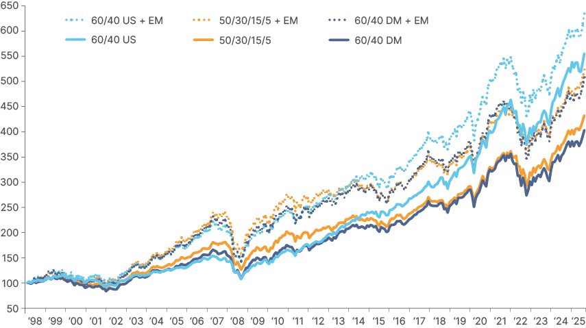
Beyond prudence, logic, macroeconomics, and size and liquidity of markets, a quick glance at the longest efficient frontier that investors may adopt shows adding exposure to EM increases portfolio returns. Fig. 2 shows the performance of three theoretical passive portfolios since 31 December 1998 and compares it with the performance of the same allocations with an additional exposure to EM. In summary, adding EM exposure to almost any portfolio (dotted lines of Fig. 2) improved total returns, without increasing volatility significantly.1
- 60/40 DM = MSCI World / JP Morgan GBI DM Bonds
- 60/40 DM + EM = 40% MSCI World; 20% EM eq.; 25% DM govt; 15% EM debt
- 50/30/15/5: 50% DM equities, 30% DM bonds; 15% commodities2; 5% DM cash
- 50/30/15/5 + EM: Adds 1/3 of EM across equities, bonds, cash3
- 60/40 US: 60% S&P500; 40% US Treasuries
- 60/40 + EM: Adds 1/3 EM across equities, bonds4
Fig 2: Total returns with and without EM allocation
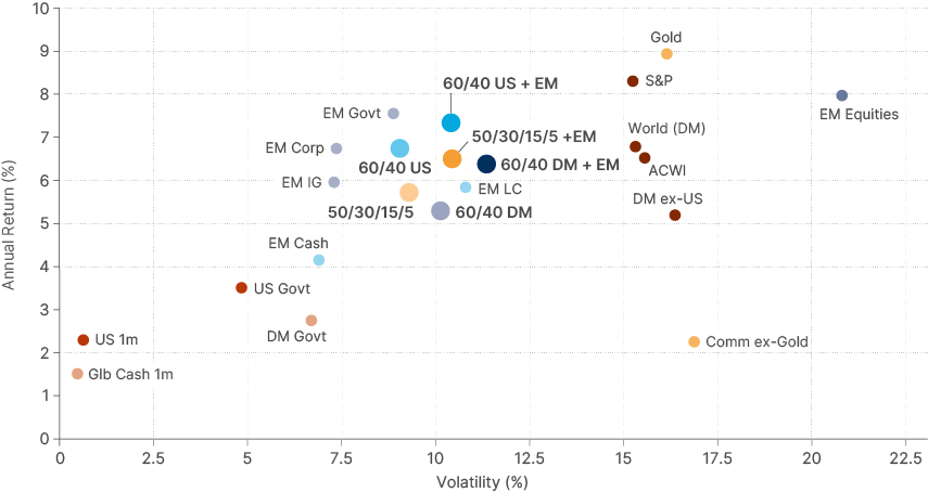
The analysis holds when plotting the returns and volatility in a scatter plot, which denotes the efficient frontier, in Dollars, in Fig. 3. The coloured dots are asset allocation models and the black dots the building blocks. Interestingly, over the period, EM equities had almost the same performance as the S&P 500, but with higher volatility, which is explained by the currency volatility.
Fig. 3 also suggests that EM Dollar debt, should be part of the strategic allocation to most global portfolios. Alas, anecdotal evidence from large investors reports show a de-minimis direct allocation to EM debt.
Fig 3: Efficient frontier across asset allocation strategies and building blocks
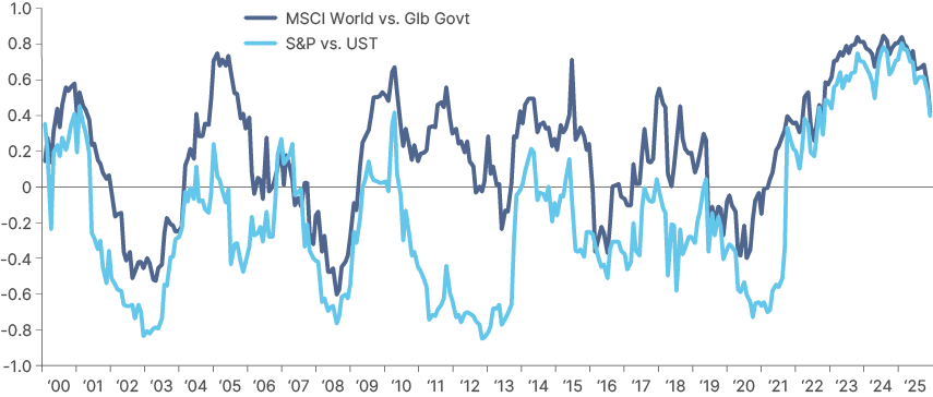
Correlations and portfolio construction considerations
Bond vs. stocks correlation has remained positive since April 2021. This means that bonds do not diversify equity portfolios as effectively as they did during most of the prior 20 years. Risk parity strategies based on equities and bonds (i.e. 60/40) suffered. While the correlation started to decline in 2025, in our view, it will flip back to negative only if the Fed is unincumbered by inflation and can cut rates aggressively when equity markets sell off again. Hence the importance of the existing macro regimes and the current policies we discuss in the next section.
Fig 4: 12m rolling correlation World vs. DM bonds and S&P 500 vs. US Treasuries
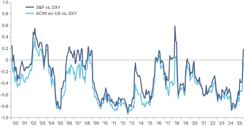
US equities relationship vs. Dollar flipped to positive in 2025. This matters for overseas investors, who have enjoyed a natural hedge to their US exposure during most of the last 20 years.
The ‘Dollar Smile’ model broke down this year. In simple terms, Dollar strength during spikes in volatility was driven by the inflow of capital to US Treasuries in excess of outflows from US equities. But elevated inflation meant the Fed couldn’t cut rates during the S&P 500 sell off in February to April. As equities and the Dollar sold off together, foreign investors increased their currency hedging, which exacerbated exacerbated the drawdown. The fact that foreign investors still have a large exposure to US assets unhedged while the US holds the largest external imbalances in the world means this relationship may not return to negative levels on a sustainable basis again.5
Fig 5: 12m rolling MSCI ACWI and S&P 500 vs. Dollar Index
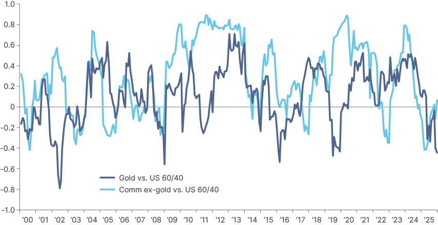
Gold and commodities ex-Gold correlation with US and global 60/40 portfolios remained low for much of the last couple of years, as their total returns increased, amplifying the appeal of a more diversified portfolio. In general, gold and commodities are a good source of protection from inflation caused by macro and policy dynamics. Gold has the additional benefit of being a preferred reserve asset for millennia. What set it apart from other commodities in recent years has been the increased demand from central banks and retail investors.
Fig 6: 12m rolling correlation of gold and commodities ex-gold vs. 60/40
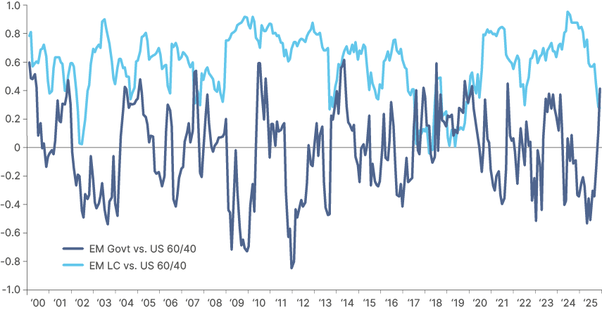
EM USD Sovereign vs. 60/40: EM Sovereign debt has had a very low relationship with US 60/40 portfolios, even lower than global 60/40 allocations. Interestingly, anecdotal evidence suggests US investors have less exposure to the asset class than global investors. Another interesting element is that the correlation between EM Local Currency (LC) and US 60/40 portfolios has been declining. Obviously, this is related to the Dollar weakness when US stocks struggled. But the broader diversification away from the Dollar and EM local bonds high interest rates in both nominal and real terms, suggests there will be increasing demand for it going forward.
Fig 7: EM Debt (LC and USD) vs. US 60/40
In summary, shifting correlations between asset classes are important to monitor. The simple 60/40 US-only portfolio has had a good run over the years, but the weaker Dollar trend on the back of fundamental (twin deficit) and institutional deterioration suggests that (even US) investors should consider a more diversified portfolio.
The inconvenient truth
In a piece written on 31 January, we quantified the macro factors behind the US capital market exceptionalism of the last 10 years. The analysis suggests that the pro-cyclical fiscal stance since 2017 is likely to be responsible for most of the above-trend earnings per share growth from the US equity market over the period. It follows that, if fiscal expansion reverses to fiscal consolidation, US earnings growth should fall back towards its long-term trend – strong, but not particularly ‘exceptional’ relative to many other stock markets, particularly EM ones.6
The rest of this piece will explain why, in our view, the US is moving towards fiscal consolidation, while Germany, China (and maybe Japan) are moving towards fiscal expansion. This fiscal policy divergence suggests asset allocators should be looking to, in our view:
- Pay long-end EUR rates vs. receive front-end to intermediate US rates.
- Buy RoW currencies (EUR, JPY, RMB, EM), sell USD.
- Buy RoW equities vs. US equities.
The spectre of fiscal dominance
The concept of ‘fiscal dominance’ has been around for a while but is fast becoming part of the zeitgeist among market commentators. Put simply, fiscal dominance arises when monetary policymakers lose degrees of freedom in their job of controlling inflation. In theory, this dynamic should not be a problem in a world where most central banks have been independent for generations.
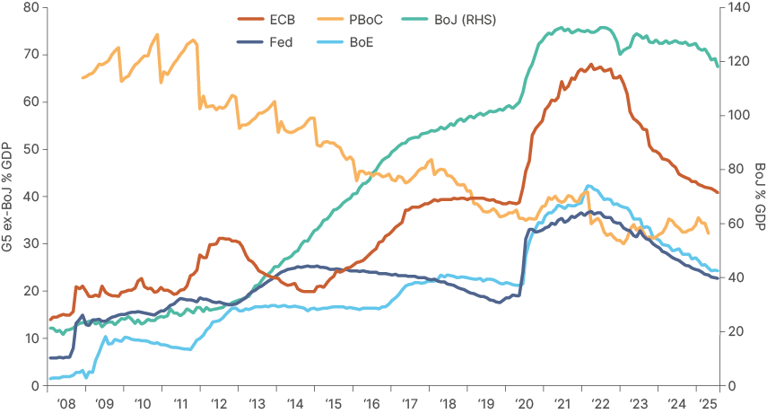
Nevertheless, history suggests that the degree of central bank independence varies according to the circumstances. Fiscal dominance can take several shades, and two have already been evident in US markets in recent years. Central banks voluntarily kickstarted a kind of fiscal dominance when overindebted governments, faced with the onset of the pandemic, borrowed lavishly to distribute money to individuals and companies. The extra borrowing created a supply/demand imbalance in bond markets, which DM central banks filled by aggressively purchasing government bonds.
Central banks purchasing bonds is not a novelty, but the effect of the COVID quantitative easing (QE) was very different to the post-Global Financial Crisis (GFC) QE. From 2008 to 2019, G4 central banks purchased government bonds and other assets from banks to recapitalise the banking system. Central banks were simply accumulating securities on the asset side of their balance sheet and increasing bank reserves on their liabilities. Because banks were overleveraged in the GFC, most of these reserve assets were not passed on to individuals or companies.
During the pandemic, the size of QE was very similar, or larger than, governments’ fiscal expansions (. It was therefore, much closer to direct debt monetisation. Lavish government spending drove money directly into the real economy, while the system was grappling with supply shortages. It was difficult to frown on these policies in H1 2020, when the world was in crisis mode and there was no certainty about the virulence of COVID-19, and no vaccine. While it was not hard to see this policy combination as inflationary, especially from Q4 2020, when vaccines were developed and healthcare systems were better supported, central banks either failed to spot the risk or turned a blind eye to it. This ultimately led to a large demand shock which, when combined with high goods prices post-COVID due to supply chain disruptions, led to the worst global inflation spike since the 1980s.
Fig 8: G5 central bank balance sheets7
A second kind of fiscal dominance happens when fiscal policy becomes more significant than monetary policy in driving economic activity. This has arguably been true in the case of the US for the last two years, where rates had to stay ‘higher for longer’ partially due to pro-cyclical fiscal policies buoying demand.
Another side of this coin is that very large government deficits also mean very large interest costs. When rates rise, so do interest payments to bondholders. This constitutes a flow of money from the government into the economy, a stimulative cash transfer to savers (and banks) offsetting some of the contractionary effect of rate hikes. The larger the stock of government debt is relative to the stock of private credit, the more pronounced this effect is.
These dynamics are evidently problematic. The most direct form of fiscal dominance, however, is when an independent central bank is forced to cut interest rates or is unable to hike in an inflationary environment. This can be due to captivity by the executive branch, such as Türkiye in 2021, or due to government indebtedness so large that hiking rates could exacerbate inflation, rather than quelling it.
This counter-intuitive phenomenon can happen through the currency channel. If a country’s fiscal and external imbalances are unsustainable and deteriorating, interest rates hikes can cause market participants to anticipate a recession and lead to capital flight. Large currency depreciations caused by an increase in the risk premium would mean lower purchasing power from higher inflation, and fiscal dynamics deteriorating further as the country is forced to react to a recession.
Faced with this situation, the best a central bank can do is to keep interest rates low enough to avoid the death spiral described above, but high enough to avoid inflation and inflation expectations getting totally out of control. The market consequences of this would be a weaker currency, a steeper yield curve and rising prices of scarce assets such as gold. Equities would also likely rally, due to loose financial conditions, especially the companies that can pass through higher costs to their goods and services. This asset price inflation will make some investors rich. But for most, this feeling of wealth will be temporary, as really, it is just the value of money that is being deflated, a term economists call the “money illusion.”
Slippery slope
It is much easier for a country to adopt profligate policies than to unwind them. Central banks recognised too late that they had overdone their interventions in 2020-2021. Inflation was out of control, requiring tighter monetary and fiscal policy for a prolonged period. While the pivot from central banks was welcome, not only were they late (inflation had already spread through the system and wages), but their main monetary policy tool (interest rates) was blunted by their bloated balance sheets.
The large balance sheet of the central bank represents, in practice, the amount of interest rates exposure taken out of the system. Data suggests that the duration-adjusted percentage of US Treasury bonds held by the Fed rose from 23% to 39% from 2019 to 2022. Similarly, total UK Gilts held by the BoE, by the same metric, rose from 31% to 39% during the same period8. This means that interest rate hikes had less of an impact on the financial system than intended, demanding higher rates to stabilise inflation, which was also being propelled by the income distribution effects of higher rates.
Problematically, the US government also expanded the primary deficit while interest expenditures increased. This procyclical economic boost raised aggregate demand and made it very difficult for inflation to decline to the target. This period of high rates and unusually elevated fiscal spending explain the increasing unsustainability of fiscal dynamics in the US.
Regime change at the Fed?
Against this backdrop, there has been mounting pressure on the Fed Chair, Jerome Powell, to resign. Initially the pressure came from Trump. More recently, however, US Treasury Secretary Scott Bessent has been talking about a “wholesale review” of the Fed.
One of the candidates to replace Powell, former Fed Governor Kevin Warsh, mentioned regime change with a new accord between the Fed and the Treasury, with the objective of re-establishing Fed independence. If the market perceives the Fed as a subordinated institution, inflation expectations will increase as the market prices lower short-term interest rates and a weaker Dollar.
Exiting fiscal dominance: fiscal consolidation and GDP growth
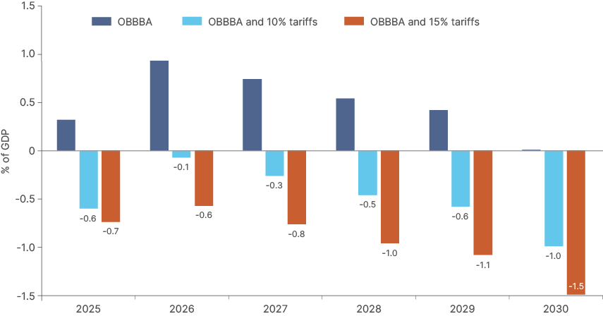
While the US is not yet in full-scale fiscal dominance, the current administration is looking to divert from it. Its objective is to create a macro environment conducive to lower rates, higher growth and stable inflation. And despite what media headlines and many economists suggest, in our view, the combination of the One Big Beautiful Bill Act (OBBBA) law passed on 4 July with tariffs is likely to lead to a fiscal consolidation. An important first step.
The OBBBA itself is fiscally neutral over 10 years, but not over the next five years. Tax cuts for individuals and businesses are frontloaded, while the largest expenditure cuts to Medicaid and SNAP programmes are not expected to kick in until 2028.9 However, the marginal driver of primary deficits in the next few years will not be the measures passed in the budget; they will be tariffs. Customs revenues were already running at an annualised pace of USD 320bn in June, from USD 80bn 12 months ago.
At this run rate, overall tariffs in 2025 are likely to generate between USD 230bn and USD 290bn (0.8%-0.9% of GDP). From 2026, this will likely rise to between USD 360bn and USD 530bn (1.1%-1.6% of GDP), assuming an effective tariff rate between 10% and 15% and assuming US imports to GDP reach their lowest level in 20 years, but not below it.
These numbers are much larger than the OBBBA’s front-loaded stimulus, which is expected to be 0.3% of GDP in 2025 and to peak at 0.9% of GDP in 2026. The result is a consolidation as per Fig. 9. The trade deals with Japan and Europe announced in recent days suggests we are closer to the high end of our range estimate.
Fig 9: OBBBA stimulus and OBBBA + tariff increases in two scenarios
It is also noteworthy that most of the stimulus relates to incentives for research and development (R&D) and fast tax amortisation of investment in factories, along with an increase in SALT deductions.10 Alongside the de-regulation measures, the policy is designed to support private sector investment-led growth. The government will also hope that higher productivity driven by artificial intelligence (AI) and de-regulation, alongside more private sector investment, will support growth, but also be non-inflationary or disinflationary. If true, the US economy may well be able to pull out a strategy of faster growth without suffering a significant inflationary impact.
The main risk for relying on tariffs to balance the books is if they are implemented carelessly and bring about a stagflation environment. The risk of negative economic effects from tariffs increases once tariffs are elevated above 15%.
We still believe that tariffs ultimately won’t settle much above 15%. Trump cares about his popularity and, with important mid-term elections next year, he will not want to alienate his support base with either a recession or high inflation. The other risks to this thesis are populist measures approved over the coming quarters that derail the fiscal architecture of the OBBBA + tariffs and bring fiscal dominance back into view.
Lower inflation pass-through from goods to services
To establish a credible and effective monetary policy with lower rates, fiscal consolidation from tariffs is only the first step. Trump and Bessent would like to have a forward-looking central bank that would agree with their views that tariffs won’t be inflationary.
Ultimately, they might be right, and some Fed Governors already share their views. Tariffs mean goods prices will go up. But the reality is that inflation does not come from a price increase in certain goods, but from the pass-through of higher tradable goods to non-tradeable services. In other words, without an increase in real wages which boosts demand, supply shocks tend to be temporary.
The tariff shock is very different than the pandemic one. This time there is no wage shock driving higher demand. As prices increase in tradables, it is fair to expect less disposable income will be available for services, particularly in an environment of fiscal consolidation. And the service sector is 80% of the US economy and 60% of the CPI inflation basket.
Foreign sellers and US importers of goods are also likely to absorb some tariffs within their profit margins. This is especially true in sectors faced with over-supply and fierce competition (i.e., autos). Thus, this time around, in our view, policymakers should be disregarding the current price shock as transitory, unless evidence points to the contrary. So far, US CPI inflation has been showing higher good prices offset by falling service price inflation. A group of Fed Governors led by Christopher Waller thinks rates should be lower for the reasons we have just described.
Threading the needle: Lower rates, but no inflationary pressures
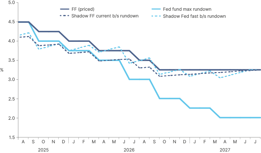
Another important element of monetary policy which could be used to establish a credible regime is the Fed balance sheet. Christopher Waller and Kevin Warsh have both been advocating for shrinking the balance sheet, which would allow the Fed to cut rates without generating inflationary pressures. Warsh even suggested a rule-of-thumb calculation where USD 1trn of balance sheet (c. 3% of US GDP) expansion/contraction is the equivalent of a 50bps cut/hike in Fed fund rates. The combination of rates and movements in the balance sheet can be combined to create a ‘shadow Fed funds rate.’
Figs. 10 and Fig. 11 show this shadow Fed funds rate for two balance sheet rundown scenarios. The blue line of Fig. 12 extrapolates the current balance sheet rundown (1% of GDP per year) and the orange line accelerates it (5% of GDP per year), slightly lower than the pace from a year ago. The shadow Fed funds rate on Fig. 12 (dotted blue line), suggests that, with a faster balance sheet rundown, the Fed would be able to cut policy rates to 2.0% over the next 24 months and achieve a similar level of monetary policy restriction than current priced by future markets.
Fig 10: Fed fund rates vs. shadow fed fund
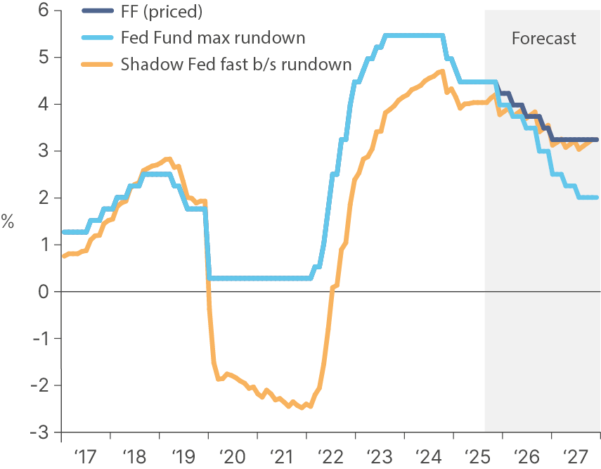
Fig 11: Balance sheet reduction scenarios
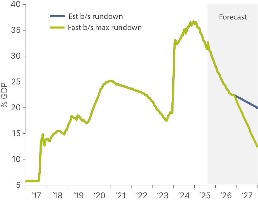
Fig 12: Forecast shadow Fed funds rates under two balance sheet scenarios
This line of thinking remains theoretical, yet it makes sense. It also potentially explains why we have not seen a recession. If you consider that the actual monetary policy rate was not the Fed funds rate, but this ‘shadow rate,’ then the 2s10s yield curve would not have inverted this. This scenario would be positive to asset prices in general, particularly for EM.
What makes this interesting is that it is sensible from a macro perspective, increasingly likely to happen, but totally out of consensus. If this is the route the Fed chooses to go down, we would expect market volatility to pick up, particularly if the measures are not carefully communicated ahead of implementation. If it doesn’t work, the impact will be higher prices and inflation expectations and steeper curves, which would lead to a faster depreciation of the Dollar.
Global context: Germany and China’s fiscal stimulus
While the US is carrying out a fiscal consolidation, Germany and China are on the opposite side. Earlier this month, both houses of the Bundestag passed the first reading of the budget, including a tax relief package for the corporate sector, increasing cash outlays in H2 2025 by EUR 34bn (c. 1.5% of GDP) from H1 2024. This will be the largest mid‑year increase since the 2020‑21 pandemic support wave. The full-year expenditure will increase by EUR 57bn with an additional EUR 9bn one-off tax relief, adding up to EUR 66bn (c. 1.6% GDP). Around two-thirds of the increase will be focused on public investments in railway infrastructure, roads and bridges, waterways, and defence, areas that have high multipliers. We anticipated this dynamic in a previous piece.11
Meanwhile, in China, the government is offering cash handouts as an incentive for couples to have children. Families will receive RMB 3.6k per year per child under three years old. Morgan Stanley estimates the programme’s annual cost at 100 billion yuan, assuming 9 million births a year. Bloomberg reported that social needs expenditures rose by 6.6% yoy in Q2 2025. Overall, China’s existing budget would inject c. 1.2% of GDP in H2 2025, reducing the downside risk from tariffs.
This fiscal divergence means it is likely that GDP growth will be better supported in the rest of the world, in relative terms, than in the US. The weaker Dollar has also been supportive to asset prices and financial conditions in the rest of the world, compensating for the tariff impact.
Conclusion
Investors have started to realise that they must have a more balanced asset allocation strategy. The large concentration of indices makes portfolios highly vulnerable to a country that has benefited from driving forces that are going into reverse. The Dollar has lost its mojo in H1 2025. The rebound in US equities renders valuations very challenging again. Equity investors focusing on overall market cap and/or turnover would have a much smaller allocation to US and a larger allocation to the rest of the world, particularly EM.
Against this backdrop, the US administration is working to engineer a fiscal consolidation via higher tariffs, while Germany and China are providing stimulus in line with the needs of their economies (infrastructure and defence in Germany, social security in China).
We believe investors will move on from pure hedging considerations to relocating large portions of their portfolios. Early investors stand likely to benefit the most, in our opinion.
1. EM Debt is 2/3 JP Morgan EMBI GD (USD Sovereign) and 1/3 JP Morgan GBI EM GD (Local currency bonds). For simplicity, we’ve added no exposure to EM corporates, even though doing so would lead to better risk-adjusted returns. The performance of EM Corporate debt (JP Morgan CEMBI) and EM LC bonds from Dec-1998 to Dec-2002 is estimated their relationship with the EMBI GD and the ELMI+ Indices. We have also used the ELMI+ as a proxy for EM cash.
2. Commodities = 2/3 gold and 1/3 commodities ex-gold.
3. LC bonds and cash are 1/3 of the EM allocation.
4. Only EM dollar assets within FI.
5. See – ‘A multi-year tailwind for EM assets’, The Emerging View, 30 May, 2025.
6. See – ‘The inconvenient truth behind US exceptionalism’, The Emerging View, 31 January, 2025.
7. ECB = European Central Bank Fed = Federal Reserve PBoC = People’s Bank of China BoE = Bank of England BoJ = Bank of Japan
8. Sources: Federal Reserve, Bank of England, Bloomberg, Ashmore.
9. Supplemental Nutrition Assistance Program (SNAP).
10. State And Local Taxes (SALT) deduction.
11. See – ‘Germany’s historic fiscal shift: The impact on emerging markets’, The Emerging View, 20 March, 2025.