
Short on time? Download the four-page summary.
Introduction
As emerging market (EM) outperformance extends, investors are now frequently asking us about flows to EM assets.
In this month’s Emerging View, we review data from Morningstar which confirms our answer: that net inflows have become a reality only since H2 2025. That’s despite EM debt1 outperforming developed market (DM) debt for the best part of the last four years, and EM equities outperforming the US markets for the last 18 months.
Now, however, the flow momentum is undeniable. Flows year-to-date (YTD) into both EM equity and fixed income have been large versus historical norms. This makes short-term performance vulnerable to a large volatility shock, should we experience one. Still, we’d expect EM assets to outperform, as they did in April 2025, should this volatility shock occur. This makes us comfortable we are not at the beginning of the end – but at the end of the beginning – of a global rotation back into EM assets.
Flows: Picking up fast, but smaller than you think
Morningstar flow data estimates encompassing global emerging markets ETFs and mutual funds show that EM debt received USD 31.6bn inflows and EM equity received USD 35.7bn in 2025, a total of USD 67.3bn.
To put these numbers into perspective, during the late bull market cycle in EM from April 2009 to May 2013, when investors rotated away from the US to EM after the Global Financial Crisis (GFC), EM debt received inflows of USD 220bn and EM equity USD 234bn. This equates to a total of USD 454bn, or USD 111bn per year, almost double the inflows in 2025, at a time where the market cap of the tradeable EM universe was significantly smaller, and the value of the US dollar was significantly higher.
The macro backdrop corroborates our view that we are in the early stages of the rotation. Concern persists around institutional deterioration in the US and the massive amount of overallocation to US assets from both domestic and international investors. The large valuation gap between US and EM, alongside the improving economic fundamentals and earnings per share in EM, means this rotation is accelerating. That shift is also putting downward pressure on the Dollar, which in turn weakens returns on USD assets and encourages further flows into non-US markets.
Emerging Portfolio Fund Research (EPFR) data via Bank of America show YTD EM inflows to 18 February were USD 73.0bn. Of this, USD 11.9bn went into EM debt and USD 61.1bn to equities. The sharp acceleration of YTD flows has raised questions of whether the rotation is overdone. Flows are clearly running quite hot, and therefore may be vulnerable to setbacks, but in the context of our macro base-case laid out in our 2026 Outlook2, it is more likely the rotation flows have barely started.
The end of the beginning
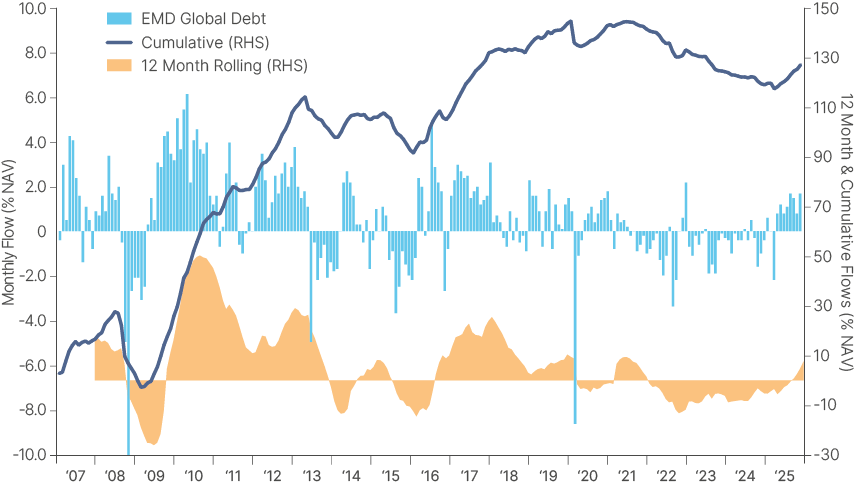
Looking at flows as a percentage of net asset value (% NAV) gives a much better perspective than nominally. Flows to EM debt were negative from 2022 to 2024, as per Fig 1. The large monthly outflow (light blue bars) following last April’s “Liberation Day”. means 12-month cumulative inflows (orange area) turned positive only last September. Overall, the cumulative flows as % NAV (blue line) are still in the same ballpark of the prior peak in April 2014.
Fig. 1: EM Debt flows as % AUM: Monthly, 12m rolling, and cumulative
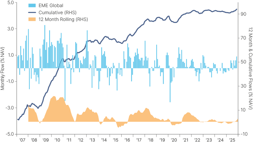
Flows to EM equities have generally been more positive over the past decade, despite periods of underperformance, perhaps reflecting the need for frequent portfolio rebalancing while US equities were running hot. Nevertheless, cumulative flows to EM equities have been modest since the peak in May 2018. The 12-month inflows have been mostly negative since 2021 and turned positive only in October 2025, as per Fig. 2:
Fig. 2: EM Equity flows as % AUM: Monthly, 12m rolling, and cumulative
Cumulative flows in USD terms (Fig. 3) make for an easier visualisation, despite losing the nuance of the equivalence between the Dollar now vs. 15 years ago.
Fig. 3: EM Equity and Debt Cumulative Flows (in USD bn)
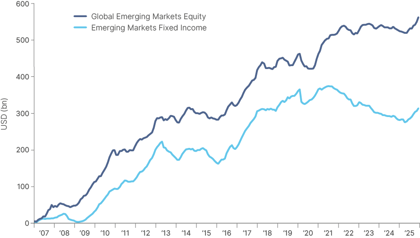
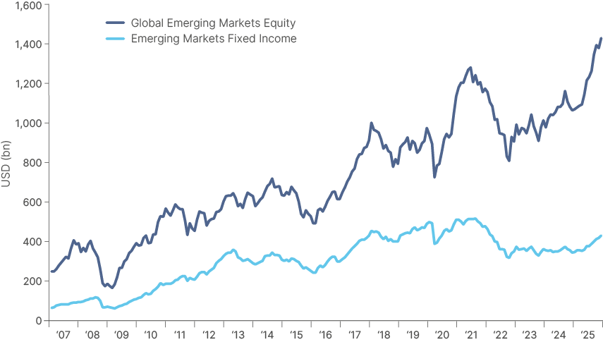
It also shows that since 2007, EM debt received just over 50% of the flows directed to EM equities. EM equities are a far larger asset class, having become mainstream in the 1990s. It therefore had greater inflows in the 2002-2007 bull run, before the inception of the data we analysed. Total assets under management (AUM) of global EM equity funds, including ETFs and mutual funds, is approximately USD 1.4trn, around 3.5 times larger than the AUM of EM debt funds, as per Fig. 4. EM debt became mainstream only between 2002 and 2007, attracting significant inflows from 2009 to 2013, and again from 2016 to 2020.
Fig. 4: EM Equity and Debt AUM (in USD bn)
What flows tells us about the big picture in global markets?
Looking at global flows across all equity markets over time provides useful insight into asset allocation trends. Fig. 5 illustrates five major liquidity waves since 2007. Notably, the pandemic liquidity wave was twice the size of the three preceding waves and the current one, reflecting the scale of policy stimulus that found its way into capital markets and drove inflation higher.
Fig. 5: Flows to global equities (12-month cumulative): All Morningstar categories since 2007 (USD m)
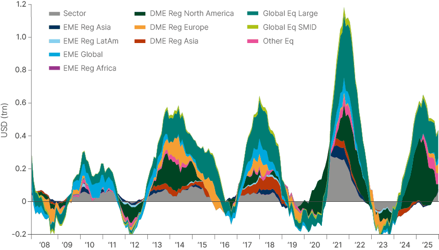
The green areas are North America and large caps (mostly US stocks). As the chart clearly shows, the first liquidity cycle post-2008 led to very little flow into the US. Instead, inflows to global EM (light blue) dominated. The second and third waves show large inflows to Europe (orange) and DM Asia (red) after the EU debt crisis and during the ‘coordinated global growth’ episode. Post-pandemic, most flows went to the US (green) and sectoral funds (grey).
Looking closely, you can see the return of inflows to EM and Europe over the last few years, as well as to sectoral funds (likely dominated by metals) as the 12-month cumulative flows to North America and large cap declines.
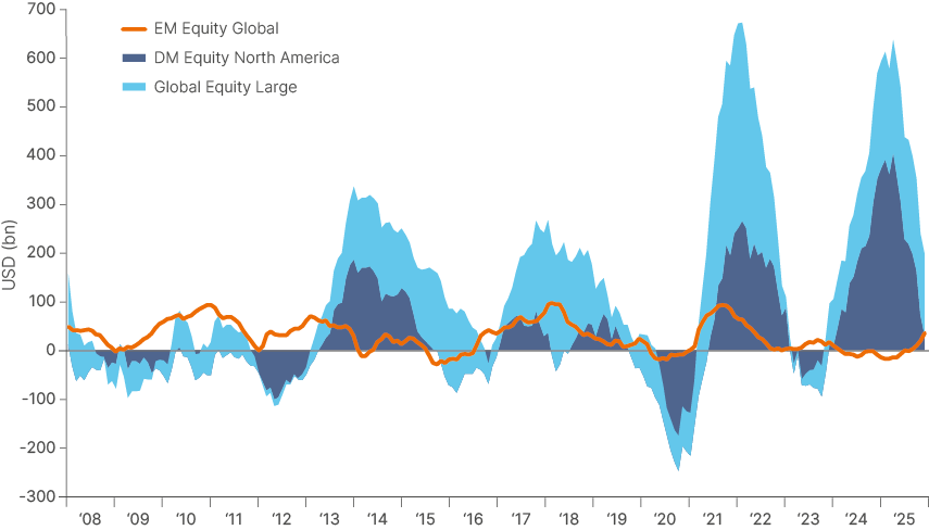
Contrasting flows to US and EM equities is also illuminating. Fig. 6 shows evidence of rotation cycles out of and into EM and more synchronised cycles.
- Post-2008: Outflows of US and inflows into EM (rotation to EM).
- Taper-tantrum (2013): Outflows of EM and inflow into US (rotation to US).
- The following two waves (2017 and 2021) were more synchronised, but the capital flowing to US was 2.5x and 7.0x what flowed to EM.
- The 2024 wave was again dominated by the US as EM suffered outflows (large rotation).
- Since September 2025, flows to US have been receding while EM flows have increased (early rotation).
Fig. 6: Flows to global equities: DM and Large Cap vs. EM
All Morningstar categories since 2007 (USD m).
Asset price impact
Flows to EM assets, both debt and equity, have historically had a much higher correlation with returns than flows to DM assets.
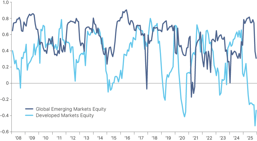
By assessing monthly inflows into EM funds as a percentage of AUM, we know that since 2006, the correlation between flows and monthly returns for global EM equity funds has been 0.56. At many points, the relationship has run at significantly higher levels on a 12-month rolling basis (Fig. 7) for protracted periods, with accelerating momentum in flows and returns being coincidental. Of course, this makes intuitive sense – investors buy into rising markets, and vice-versa.
Fig. 7: 12-month rolling correlation EM flows vs. MSCI EM and DM flows vs. MSCI World
However, the higher correlation between EM flows and returns is clear. Fig. 8 depicts the rolling two-year average of 12-month correlations between flows and returns for DM and EM equity, a helpful visual of the strong relationship between flows and returns for EM equities through the cycles.
Fig. 8: 2-year moving average of 12-month correlations between flows and returns for DM and EM equity
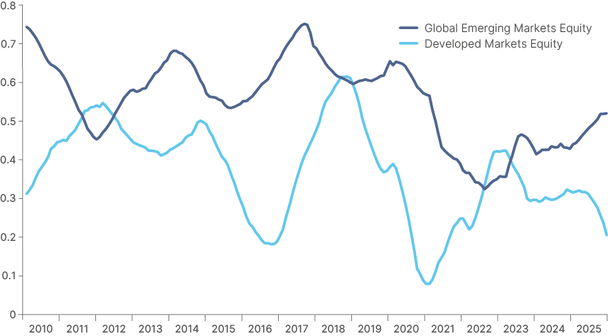
We were not surprised by the results of this analysis. EM equities are a much smaller asset class than DM, and although they are generally very liquid these days, are still more thinly traded than DM stocks. Periods of consistent asset allocation to EM also tend to come only after outperformance relative to DM has already been in place for a period.
What did catch our eye in this chart, however, is the divergence of flow/return correlations between DM and EM stocks since mid-2025. The DM correlation is turning sharply lower, as EM turns higher. Recent inflows to US markets have not coincided with better performance, while accelerating flows into EM stocks are promoting further momentum in returns. Since 2010, three out of four of these inflection points have presented a good opportunity to increase allocation to EM vs DM (Q1 2025, Q1 2020, Q3 2016). Buying EM relative to DM in early 2012 would not have led to good results in one-year forward returns. However, during this period EM flow/returns correlation were inflecting higher due to outflows and negative performance, the opposite scenario to today.
We find that relative performance between EM and DM equities also has a very significant impact on relative flows, or rotation. Given the correlation between flows and performance, this becomes a reinforcing phenomenon. Fig 9 shows the 12-month relative return between EM and DM versus their 12-month relative cumulative flows. The correlation between these two measures is a solid 0.63.
Fig. 9: 12-month relative return and 12-month relative flows: EM vs. DM
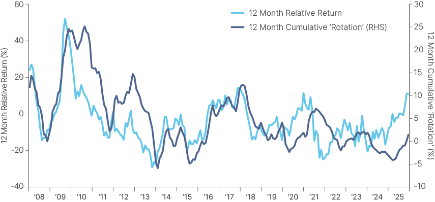
We do not find, however, a correlation between one-year forward returns, and trailing flows, indicating that divergent returns are the primary driver of rotation, rather than the other way round. As clearly visible in Fig 9, EM outperformance vs. DM (light blue line) is leading the rotation flows from DM to EM (dark blue line). The chart suggests rotation only started in November 2025 (dark blue line >0%), signalling we are still very early in the cycle.
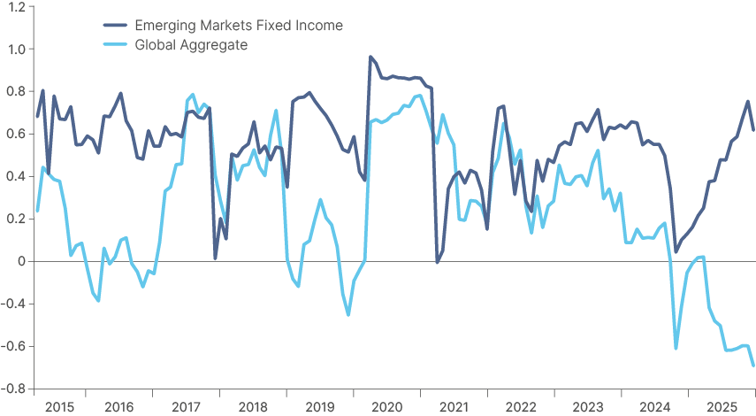
EM global sovereign fixed income returns (EMBI GD) also display a much higher correlation to flows than DM bonds (Bloomberg Global Aggregate) as per Fig 10. Again, correlations are currently inflecting, with strong performance in EM fixed income leading to accelerating inflows, while the correlation between DM fixed income returns and flows has been negative since 2024, reflecting weak returns despite inflows over the period.
Fig 10: 12-month rolling correlation between flows and price: EM debt (EMBI-GD) vs. DM debt (G Agg)
Global macro risks
In our 2026 Outlook3, we made the case for a ‘goldilocks’ macro setup in 2026, with global GDP buoyed by AI capex and global inflation declining under still-restrictive monetary policy and softening labour markets. This would mean many central banks – most importantly the Federal Reserve (Fed) – can cut rates more than markets are pricing, providing upside to both risk assets and bonds. In DM, we saw most potential for policy surprise in the US and the UK, given elevated rates and mounting evidence of AI impacting their labour markets. Our core thesis was, and remains, lower interest rates in the US vs. stable rates in Europe and higher rates in Japan, meaning the USD remains for sale. Not only has the data corroborated this picture so far this year, but geopolitical risks (Greenland, US mid-term elections, Iran, etc.) as well as volatility in precious metals and Bitcoin mean investors have started to realise they are very underweight EM.
This is obviously a very positive global macro setup for EM, reflected in the bullish YTD flows. The question then becomes, what can spoil the party?
The return of US (pro-cyclical fiscal stimulus) exceptionalism
We think the number one risk is the return of US exceptionalism, which as we have argued for years, was driven by expansionary pro-cyclical US fiscal policy. For example, if President Trump panics ahead of mid-terms and announces direct fiscal transfers to US citizens, this would likely put upward pressure on US inflation and growth. The Fed would stop cutting and start talking about hikes, probably leading to USD strength. The fiscal support would benefit US companies, as it did from 2017-2024, which would support US capital markets outperformance. However, we think this is an unlikely scenario for three reasons:
- Trump knows he defeated Kamala Harris in 2024 because of the cost-of-living crisis and immigration.
- His economic team is constantly reminding him of the need to keep fiscal discipline (the US did the first counter-cyclical fiscal consolidation in a decade in 2025).
- It would be hard for Congress to pass an inflationary bill so close to the mid-term elections when so many Republican seats are at risk. The odds of the Democrats winning both houses increased by 10% to 39% on Kalshi and most of this has been happening since mid-February.4
Geopolitics
We’ve been arguing that geopolitical risks are de-escalating rather than escalating, which is the common perception in the media. This is driven by the ceasefire in Gaza, more democratic and reform minded regimes in places like Lebanon and Syria, and a weakened Iran. There are now tripartite negotiations for a ceasefire in Ukraine, something few thought possible a few months ago. The operation in Venezuela is positive for Latin America in our view5, while the Greenland episode should be considered as ‘noise’, as it is very hard to imagine the US invading European territory.
Nevertheless, the current US administration likes to brandish its unpredictability like a weapon, and it may be willing to take risks in foreign policy after the significant wins mentioned above. Our analysis suggests massive mobilisation of military resources like the one carried out by the US in the Middle East now precedes a strike in 75%-80% of the cases.
Should the US attempt a quick regime change in Iran, oil prices could spike, perhaps quite significantly, depending on the response. But the main tail risk is a chaotic struggle for power akin to Libya or Syria in the country with the largest population in the Middle East. This would create a fresh flashpoint of imbalance in the border between Central Asia and the Middle East.
A classic VaR shock driven by liquidating positions
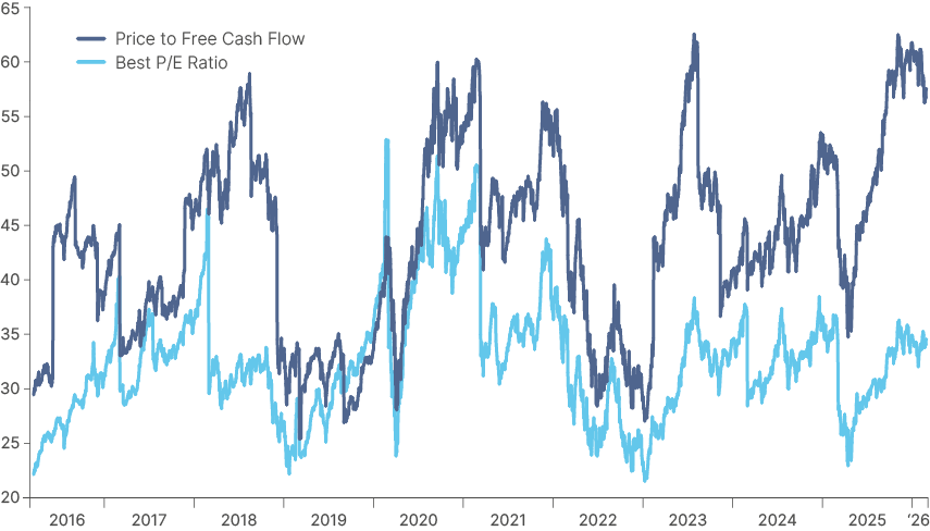
The S&P 500 index has been trading in a tight 6,800 to 7,000 range over the past two months, failing to reach a new record high despite very good earnings in Q4 2025. This tight narrow range hides much pain for specific sectors. Very large capex increases by the US hyperscalers is eating into free cash flow margins, stoking investor worries about return on equity. Such concerns are well illustrated by the divergence between now-low 12-month forward price to earnings ratios and elevated trailing price to free cash flow on the Magnificent 7 index, shown in Fig. 11.
Fig. 11: Not-so Magnificent 7 anymore: 12m forward P/E ratio and price to free cash flow
Furthermore, the unveiling of Claude’s newest model demonstrated that ‘vibe coding’ is now real. Anyone without coding experience can now build impressive software. This may well end up putting severe pressure on a sector (software-as-a-service) that has been the darling of investors for decades.
Sell-offs in precious metals and Bitcoin also point to pain in other areas. History shows that Value at Risk (VaR) shocks can happen because of an exogenous unknown shock or simply portfolio rebalancing. So far, rebalancing is putting pressure on prior winners (Bitcoin, precious metals, US IT) and supporting assets that have underperformed in the last decade, such as EM assets, commodities (ex-precious metals) and small caps. But if a VaR shock happens, portfolio liquidations would impact all assets. We believe such a shock - if not underpinned by any fundamental change in the macro environment -would likely be short-lived and present opportunities for investors to allocate to EM, as it did in 2025.
A sharp decline in AI capex driving memory prices lower
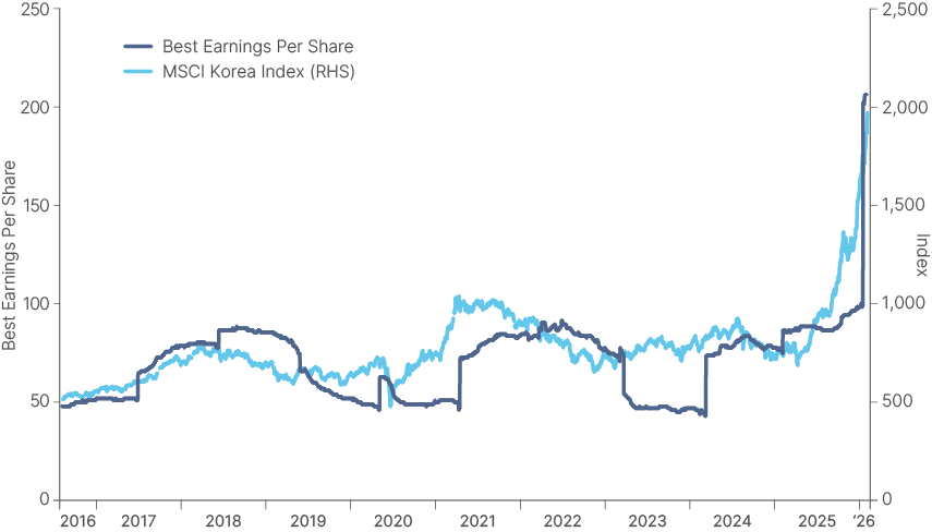
This is very unlikely, in our view. We believe AI has reached a level of development acceleration that is akin to the ‘singularity’. We may already be here. It is rare to have a technology that causes such a large, unpredictable and deep impact across almost all sectors of the economy. AI is also obviously already critical for national security purposes. Therefore, in our view, even if companies are losing money, they will keep on investing in the development of this technology, possibly buoyed by subsidies and tax incentives. One could make the case that not even a global recession would stop the capex flow in AI. Nevertheless, if capex significantly underperforms expectations, many sectors would be affected, and the growth in North Asian tech exports would likely slow or go into reverse. This would obviously weigh on stock markets such as South Korea’s Kospi, which has been on a tear due to a memory chip shortage which has driven up DRAM prices by a cool 664% in just one-year.6 This price increase is the main reason for the epic 120% 12-month rally in South Korea. Share prices still trade at a 9.25x price-to-earnings ratio due to the sharp increase in expected earnings per share in 2026 and 2027, as per Fig. 12.
Fig. 12: MSCI South Korea price and earnings (12-month blended forward)
Risk mitigants for EM investors
These are the risks. But so far, EMs have been well insulated from volatility spikes so far in 2026. In our view, this is due to the solid macro fundamentals underpinning EM markets. We have been consistently highlighting the dramatic improvement in EM fundamentals over the last five years, which led initially to the outperformance of EM debt and more recently, of EM equities. Better fundamentals also make the asset class more resilient. A (paywalled) report by Goldman Sachs from last week shows that all EM assets – five-year local bonds, currencies, credit, and equities – have become much more resilient to global shocks since 2021 than before 2021.7 This makes a lot of sense. Lower debt levels (particularly ex-China), and inflation broadly in line with central bank targets, means EM central banks do not have to tighten monetary policy to control inflation during volatility spikes. The soft USD environment also helps to mute the pressure of volatility spikes on EM local currencies.
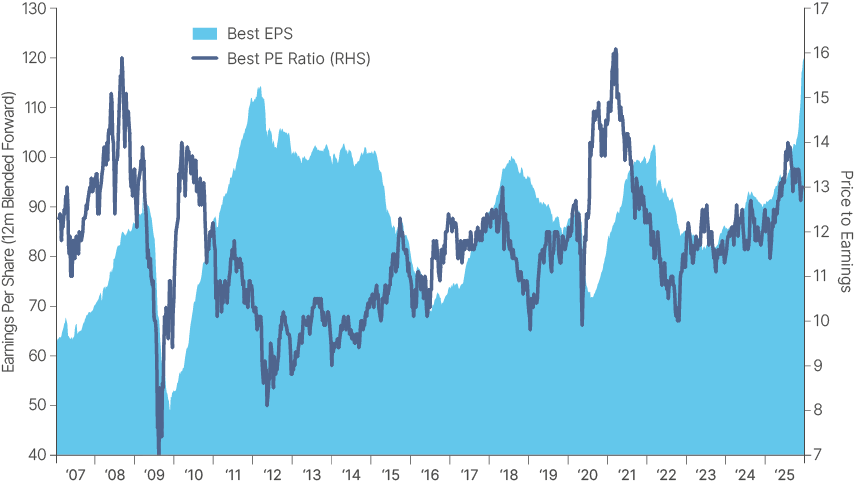
Furthermore, EM equities are now also benefiting from better aggregate earnings per share, a trend that started two years ago thanks to the improvement in Asian exports of electronic goods. The difference is that this semiconductor cycle is proving to be a super cycle, which means EM earnings per share have just printed a new record high for the first time in (gasp) 15 years, as per Fig. 13. While South Korea explains a large part of this surge, earnings are accelerating in other countries, including China, India, Malaysia, all of Latin America (ex-Brazil, until recently), and South Africa.
Fig. 13: MSCI EM: Price to earnings and earnings per share (12-month blended forward)
Summary and conclusion
Flow data confirms that a rotation back into emerging market assets is now underway — yet most investors remain underweight. The macroeconomic backdrop driving this shift looks unlikely to reverse this year, and may in fact become more supportive as the Fed continues to cut rates, commodity prices firm, and unpredictable US government policy gives global investors further reason to trim overweight positions in American equities.
The AI trade, meanwhile, has decisively migrated away from US software companies and hyperscalers toward the businesses set to benefit from supply bottlenecks created by elevated capex. Many of these sit in emerging markets — from Asian semiconductor manufacturers to metals miners across Africa and South America.
It is both these global macro tailwinds and positive economic reforms in domestic economies that are driving a renaissance in emerging market earnings per share. Many key EM economies still carry high real rates with ample room to cut in coming quarters, which should sustain further outperformance in local currency debt — the best-performing major asset class in the world last year on a risk-adjusted basis.
Risks that could derail the thesis of continued EM outperformance always exist, but we see them as low-probability events this year. We believe we are only at the end of the beginning of a longer term rotation back into emerging market assets.
1. J.P. Morgan EMBI GD index (hard currency) and J.P Morgan GBI-EM GD index (local currency), versus Bloomberg Global Aggregate index.
2. See – ‘2026 Emerging Markets Outlook’, The Emerging View, 2 December 2025.
3. See – ‘2026 Emerging Markets Outlook’, The Emerging View, 2 December 2025.
4. See – ‘British Finance in Mexico, 1821-1867’ D.C.M Platt, Bulletin of Latin American Research.
5. See – ‘Latin America: Monroe Doctrine 2.0 amid a transition to the right’, The Emerging View, 30 January 2026.
6. inSpectrum Tech Inc DRAM Spot Price DDR5 1Gx16 (Bloomberg ticker ISPPDR48 Index) 24/02/2025
7. See – https://marquee.gs.com/content/research/en/reports/2026/02/16/6f2e8bb1-a812-4750-b248-fab36802d808.html#