
Short on time? Download the five-page summary.
Note: This summary has been updated to reflect the fast-moving situation.
Introduction
The tail-risk of the Strait of Hormuz closing has materialised. Energy prices have risen sharply, and supply shortages, particularly in Asia are emerging. We hope that the conflict comes to an end as soon as possible. However, with the situation still very fluid and negotiations between the US and Iran reportedly ongoing, it is still impossible to say whether we are on the edge of a long-term oil ‘supply shock’, or not.
In this month’s Emerging View, we look back on historical oil shocks, and their impact on emerging market assets broadly, as well as the differences in performance amongst different regions and countries.
We also examine the current macro backdrop relative to the macro contexts of oil shocks in the past 25 years and give our view on the ‘game theory’ framing of the current conflict between Iran and the US.
1. A look-back at major oil shocks
Defining an oil shock is not straightforward. Oil is hypersensitive to small changes in supply vs. demand, which means several oil price spikes have come following very low prices. Looking at oil prices in nominal terms also hides the impact on spending. Looking at oil prices in real terms and annual oil demand in % of global GDP are more illustrative metrics. But to measure a shock, one needs to look at the change from a starting point. We defined an oil shock as oil prices doubling over 2-years to avoid capturing the rallies from the lows as a "shock". According to this definition we've had seven shocks since 1966 (Fig 1). Some of these have been purely supply driven, but some have been driven by a mixture of weaker supply and much stronger demand, such as in 2004-2006, and 2010-2011.
Fig 1: 2-year oil price changes and US CPI
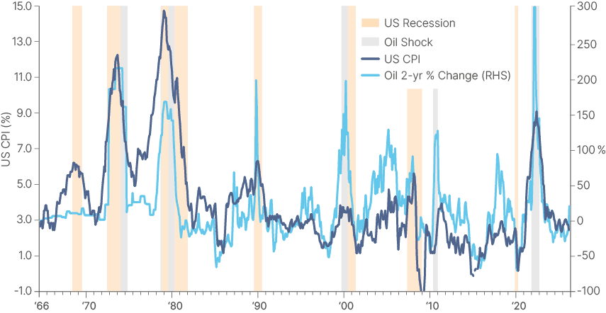
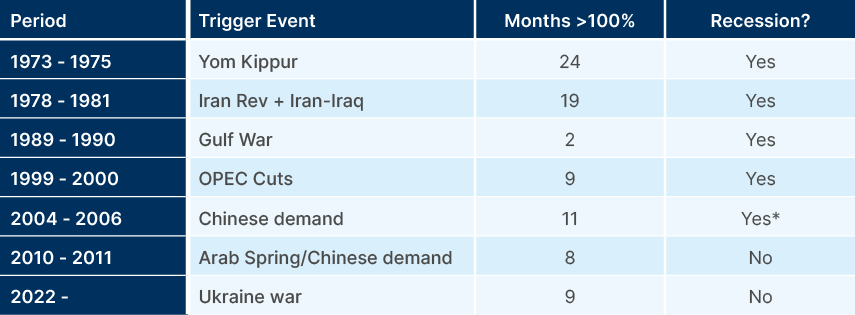
As oil and natural gas are key elements of production, fertilizers, and transportation costs, a surge in prices usually drives inflation higher. US CPI rose above 3% during each of the shocks identified above, with a high of close to 15% in 1980 and around 9% in 2022. Inflation remained better anchored during the OPEC production cuts of 1999-2000 and during most of the subsequently 20-years. Of these seven oil shocks, five led to recessions, as per Fig 2, albeit there was a longer than usual lag between the 2004-2006 oil shock to the 2008 recession when oil prices kept on rising and ultimately contributed to triggering the GFC. The 2010 oil shock was, in large part, a rebound to 2007 levels after China's massive investment post GFC boosted demand despite a weak economic recovery in the developed world.
Fig 2: Major oil shocks
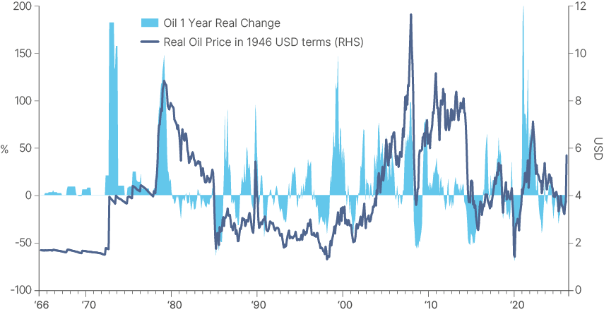
In real terms, oil prices at USD 100 are already close to one standard deviation above the median over the last 30 years, but are still 20% below the peak in May 2022 and 51% below the peak of July 2008, as per Fig 3. If we reach USD 150, oil prices would be 20% above the peak of May 2022. Some benchmarks, like the Oman Crude and products (diesel, jet fuel) are already at levels consistent with Brent at USD 150 in the past. If oil prices rise to USD 150, they would have doubled from two years ago, leading to the seventh major oil shock in 75 years. Whether they will or not depends on Strait of Hormuz (SoH) flows and the degree of damage to energy assets in the Gulf.
Fig 3: Real oil prices and 1-year changes
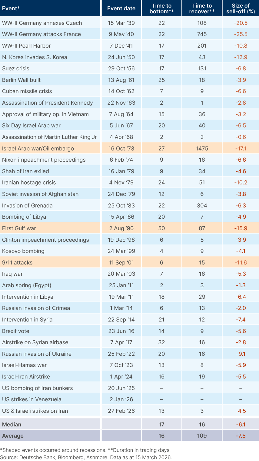
Another caveat is that this is clearly a different data-set lookback than the historical analysis of geopolitical shocks, which includes many other events, most of which had a relatively mild impact on oil prices. A de-escalation in the Middle East over the next couple of weeks – with a normalisation of oil prices over the next months – would allow the current event to look like the average of the shocks on Fig 4. Indeed, the S&P500 sold off by c. 6% since the invasion until the 26 March, close to the median geopolitical risk spikes on Fig. 4. Nevertheless, a longer conflict would look much more like a major shock.
Fig 4: Equity market selloffs and recoveries around geopolitical events
2. The Vix spike
The sharp increase in oil prices following Iran's closure of the SoH triggered a spike in volatility. On 6 March, the VIX spiked 10% above its 60-day moving average. This is a simple signal we've been monitoring, as it usually comes together with severe dislocations in asset prices that can present opportunities for investors in emerging markets.
In the last iteration of our analysis, we investigated whether buying two months after the Vix spike would generate above-benchmark returns over the next 12-months. Indeed, buying at month end, in the month following the Vix shock yielded the best results. Fig. 5 shows the average 12-month returns for different asset classes with the starting point one-month post the Vix spike signal. This includes 24 events since 1994 for EM Sovereign debt and EM equities, 19 for EM Corporate debt and EM frontier equities and 18 incidents for EM local currency bonds.
Fig 5: Active vs passive returns buying 1-month after VIX spikes (monthly data)
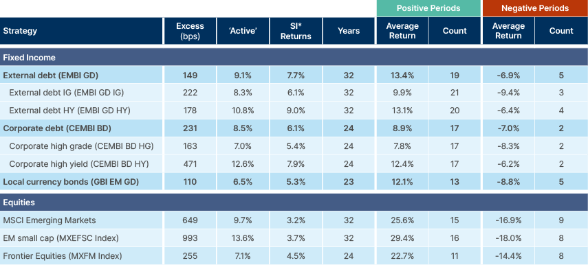
Given the Vix shock took place amidst an environment where asset prices were generally elevated, and that the volatility spike did not lead to a sharp decline in equities or credit, we think the strategy of waiting for a month before buying it remains warranted. This is particularly true given the level of uncertainty associated with the longevity and magnitude of the current oil price shock.
This also makes sense for the current conflict. Buy before the end of April only if you have a high confidence this conflict will end soon (don't trust the tweets). If the Strait of Hormuz is still closed to a large extent by the end of next month, you will be able to buy lower. We also believe that assets could behave differently, should the crisis intensify from here. Global (and EM) rates have widened significantly, while credit and equity drawdowns have been mild. We make the case that investors looking to add exposure to rates may want to pull the trigger earlier during this crisis.
3. Performance across recent oil shocks
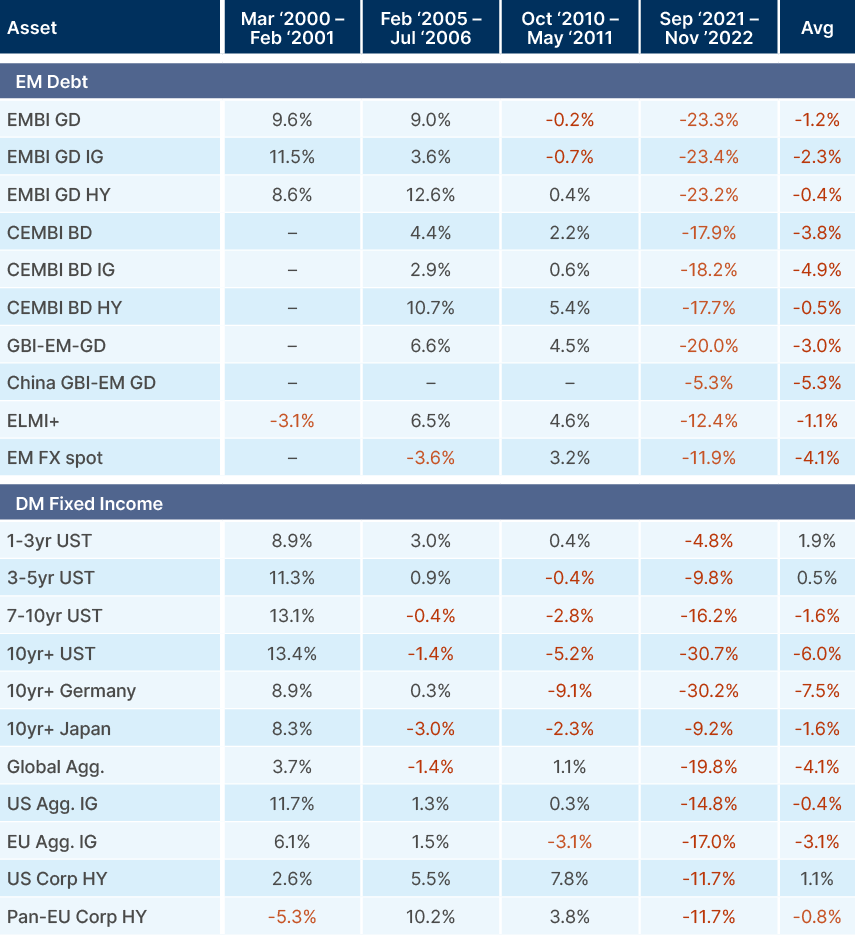
EM equities tend to underperform US stocks during oil shocks, due to their higher beta to large global risk events, and heavy exposure to oil importing Asian economies. On the other hand, EM bonds, particularly USD bonds (EMBI GD and CEMBI BD) have, on average, outperformed the Global Aggregate bond index. Total returns are protected by higher yields, and price returns supported by the various oil exporting countries within the index, as well as just pure geographical diversification.
EM local currency sovereign bonds have also been solid performers in the three global oil shocks since the GBI-EM index was launched. However, the first two of these shocks took place before the shale oil revolution, when the US was a net energy importer at a time when the US dollar tended to be inversely correlated with oil prices. This has now changed. Nevertheless, the GBI-EM performed essentially in line with the Global Agg in the 2022 oil shock. EM FX underperformed, however many EMs were ahead of the curve in monetary policy relative to the US, so they did not have to hike rates to the same extent as the US. Obviously, oil shocks don't happen in a vacuum and asset price returns during such shocks are also heavily influenced by the macroeconomic environment in which they occur. We will explore the different macro backdrops in the next section.
However, for dedicated EM investors, the key story is not relative EM performance but the divergence in returns within EM. The variability of performance across EM regions and countries in oil crises is exactly why active management is critical in EM investing, in our view.
Fig 6 shows the performance of EM and DM equities during oil shocks, followed by the performance of different bond indices. It shows the core EM countries that have historically performed best during oil shocks have been South American commodity exporters: Brazil, Colombia, Chile and Peru. The MSCI Frontier index has also been a strong performer, due to its higher weighting towards Middle Eastern oil exporters. The countries that have tended to underperform have been Asian oil importers, particularly Taiwan and Korea. India has been a surprising outperformer, despite its high oil import dependency. This is likely due to its domestically-driven economy being relatively shielded from global risk events.
Fig 6: EM returns during oil shocks vs. other asset classes
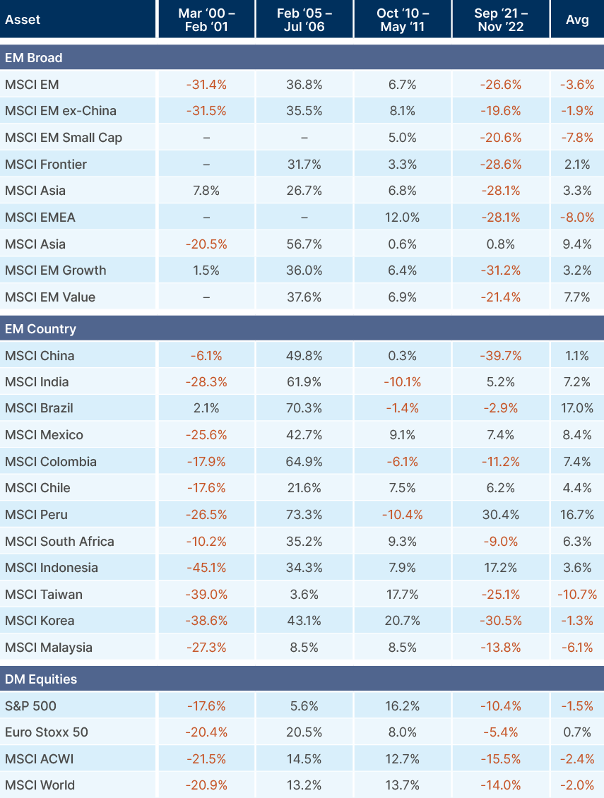
Fig 7 breaks down the performance of EM and DM fixed income indices during oil shocks. The poor performance in 2022 was driven by the fact that global and particularly US inflation was already running very hot heading into the crisis. The oil shock from the Russian invasion of Ukraine exacerbated inflation and led to rapid rate hikes from the lowest levels in history. This led to a tightening of global financial conditions, and spread widening in EM, which drove underperformance relative to the Bloomberg Global Aggregate index. Several frontier countries faced balance of payments crisis that required deep reforms, and in some cases, debt restructuring. These reforms mean they are better positioned to navigate the current oil crisis.
As expected, long bonds tend to underperform during oil shocks, (see 1-3yr UST vs 10yr+ UST), due to higher price sensitivity to rising yields. It is therefore prudent to manage duration exposure cautiously during these episodes.
Fig 7: Global bond returns during major oil shocks
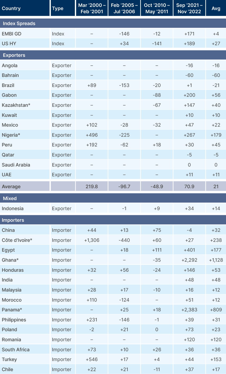
Finally, we examine the moves in spread of each country within the EMBI GD index during oil shocks, separated into oil exporters and oil importers. Computing total index averages is less useful, in our view, given how much the index has changed in the last 25 years, and that various countries saw idiosyncratic non-linear spread widening during oil shocks.
In general, the distinction is noteworthy: spread widening in oil exporters is modest during oil shocks, and spreads recover quickly after the risk-off moves. Oil importer spreads, on the other hand, tend to underperform, in some cases significantly. This data requires some caveats. The economic conditions and balance sheet vulnerabilities in each country varies tremendously across the shocks, as do the countries' exposures to energy. This is therefore only the base layer of analysis across the countries in which we invest.
Fig 8: Change in spread over US Treasuries across oil exporters and importers
4. Most vulnerable: oil importers with poor balance sheets and low inventories
The most vulnerable countries during oil shocks are large net oil, gas, and fertiliser importers with stretched balance of payments dynamics and low oil inventories. Using data from OPEC, the Joint Organizations Data Initiative (JODI) and the Energy Information Administration (EIA), we map the vulnerability of EM oil importers in Fig 9. The monitor includes dependency on oil products, the dependency on SoH for flows, as well as balance sheet and positioning.
Fig 9: Most vulnerable EM countries
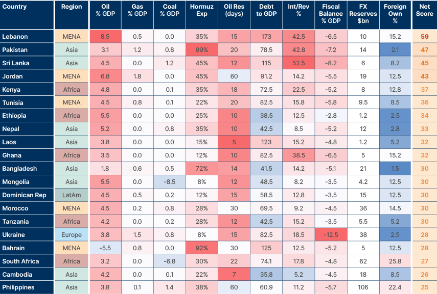
These scores capture structural vulnerability, not the policy response. Several countries are already implementing demand-side measures: Pakistan, Bangladesh and the Philippines have directed non-essential public sector staff to work from home and restricted government vehicle use, targeting demand destruction at a considerable activity cost. But the thrust of the analysis holds. Lebanon, Pakistan, and Sri Lanka all look vulnerable given their poor balance sheets and dependency on energy imports from the Gulf.
African countries added to the list include Kenya, Tunisia, and Ethiopia. Ghana's oil production and fiscal accounts have been improving, so it is likely more resilient than Bangladesh. Mongolia and South Africa both have large coal production, a key mitigant that likely positions them more favourably than being portrayed. Bahrain is very exposed to losing its oil exports with the SoH closed, while its complex demographic dynamics are additional challenges.
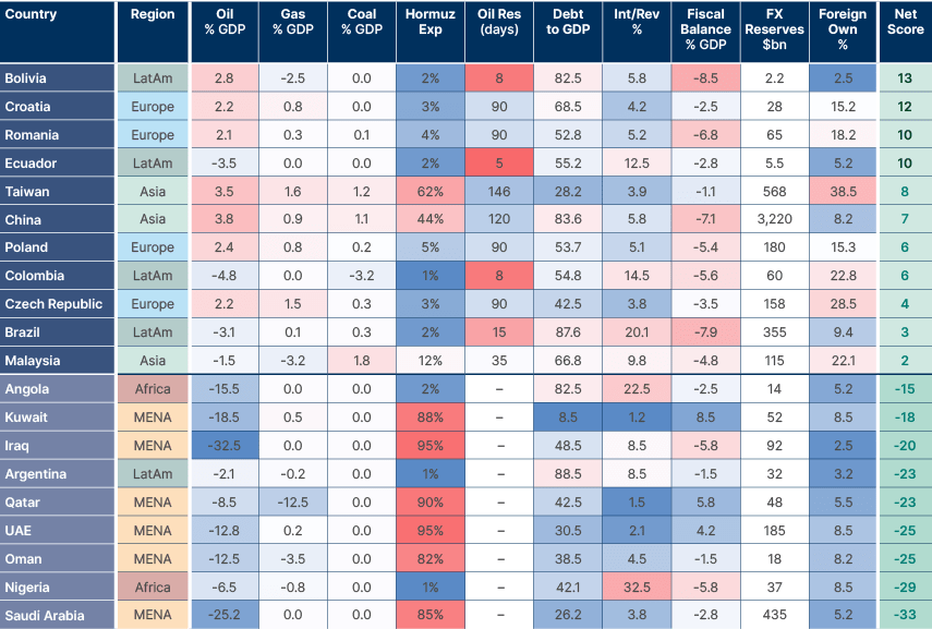
On the opposite side, countries with large oil exports that are not dependent on SoH revenues are far less exposed. Fig 10 does not consider the production losses from Iranian attacks, nor the cost from not accessing the SoH. Oman is the most resilient country in the Gulf today, as it doesn't depend on the SoH to export energy. Saudi Arabia's exports via the Red Sea – using the East-West pipeline – as well as higher oil prices mean it is losing less revenues. Qatar has suffered the biggest reported attack to physical infrastructure with an estimated 17% of production loss. On the other hand, it is ramping up production in the US and has very large financial buffers.
The United Arab Emirates (UAE) was the country arguably hit hardest by Iran, with a significant impact to its tourism and real estate industries, but like Qatar it has ample financial buffers. That leaves Bahrain, Kuwait and Iraq as the main losers with significant production cuts. Again, Kuwait has a much higher ability to absorb the shock owing to a solid balance sheet and ample reserves. The main relative winners are exporting countries outside of the Gulf include Nigeria, Argentina, Angola, Malaysia, Brazil, and Colombia. These countries are better positioned to benefit from a Middle Eastern energy shock via their terms of trade, but of course are not invulnerable to a global tightening of financial conditions.
Fig 10: Most resilient EM countries
The degree of disruption in energy assets will be a key determinant on whether flows can be normalised fast. We have been tracking, to the extent that information is available, such incidents. So far the strikes on the Northern Gas Fields Ras Laffan and South Pars were one of the few hit by a missile, damage that usually takes longer to repair. Drone attacks tend to cause shallower damage, unless of course explosions hit energy storage (not the case in most attacks). This suggests the main bottleneck, so far, is the ability to keep the SoH open.
5. Macro backdrop today vs prior oil shocks
The macro consequence of an oil shock depends less on the sharpness of the oil price spike, but the duration of the shock and the macro environment going into it. The 2021-22 episode was uniquely damaging as it happened while inflation was already soaring, and real rates were deeply negative. If the current spike in oil prices does become a bona fide 'oil shock' (+100% vs two years ago), we will be entering it with a very different macro backdrop than in 2022. Fig 11 shows the 'macro regime' context behind each oil shock. The economic environment today sits near the boundary between 'boom' to 'Goldilocks' due to elevated growth and declining inflation.1
Fig 11: Global bond returns during major oil shocks
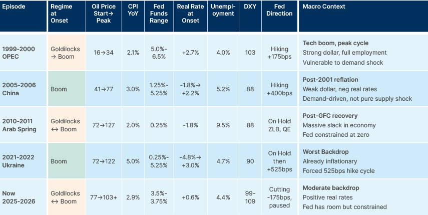
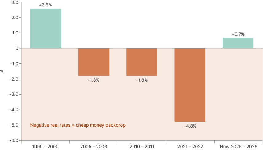
Fig 12 shows the key difference between today, 2022, and prior recent oil shocks. In 2021-22, the federal funds rate was 0.25% against CPI inflation of 5.0%, producing a negative real rate of -4.8%; emergency-level accommodation into an overheating economy preceding an oil shock. That left the US Federal Reserve (Fed) with no choice but to hike rates by 525 basis points (bps) in 18 months, which meant the supply shock was accompanied by a protracted tightening cycle that compressed asset prices across the board.
Today, with the fed funds rate at 3.5%-3.75% and CPI inflation at 2.9%, the real rate sits at circa 0.7%. That matters for two reasons. First, demand adjustment from higher energy costs happens more naturally when fiscal and monetary policy is not simultaneously running hot, and second, the Fed retains plenty of room to ease monetary policy if growth deteriorates because of the oil shock.
Fig 12: Real interest rates and inflation at the onset of the energy shock
The labour market dimension is equally important and often underappreciated. In the 2010-11 'Arab Spring' episode, US unemployment was running at 9.5%, a key reason why the oil shock, despite oil rising 76% to USD 127, was not meaningfully inflationary. The economy had enormous spare capacity, leaving workers with little bargaining power to demand higher wages as energy costs increased, thus limiting the pass-through from energy to services.
Today's labour market is more nuanced. Headline unemployment at 4.4% looks tight by historical standards, but the underlying dynamics are softer than the number implies. Labour demand is weak, with the US economy shedding around 100k jobs in February and creating virtually no jobs over the last year, aside from healthcare. Quit rates are low and job openings have fallen sharply from their 2022 peaks. AI-driven automation means that many highly paid workers have limited pricing power. It is also highly unlikely we'll see a fiscal expansion like the one from 2020-2021. Therefore, wage inflation is unlikely to amplify the energy cost shock in the way it could in a truly tight labour market, such as in 2022.
A softening labour market increases the likelihood that, as energy costs rise, demand for other goods and services will fall. This secondary demand shock is disinflationary, or even deflationary, in the medium term. If oil prices remain elevated and consumer real incomes are eroded, the more probable outcome is a growth deceleration followed by a downward wage-price spiral after the initial price-level effect dissipates.
Standard monetary policy frameworks hold that this is precisely the scenario in which the Fed can look through the initial inflation impact and instead cut rates to cushion growth. In such situations, the optimal posture is to maintain a credible anti-inflation stance – signalling readiness to act if second-round effects materialise – while refraining from actual rate increases, thereby cushioning growth without de-anchoring expectations. Indeed, 5y5y inflation expectations remain anchored slightly above 2.0% today, as per Fig 13. This stands in sharp contrast to 2022, when an initial policy mistake allowed inflation to become broad-based, bringing the 5y5y inflation swaps from 2.2% to 2.8%, forcing aggressive tightening.2 This is particularly true when higher oil prices are a result of supply shocks like the current one.3
Fig 13: US 5y5y inflation swap
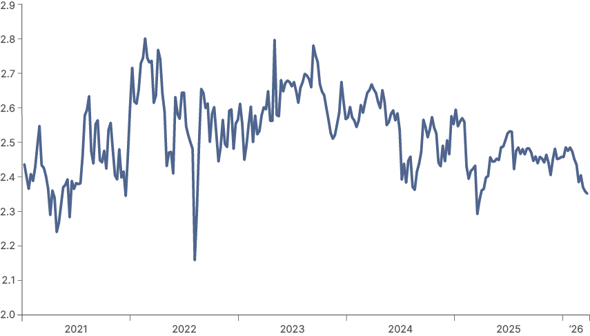
The last time the US entered an oil shock with positive real rates was 1999-2000, although the labour market then was meaningfully stronger, with unemployment at a 30-year low of 4% and genuine consumer pricing power.
The key difference today is that a softer labour market limits the pass-through from higher energy costs into broader wage and price dynamics, reducing the risk of a 1970s-style wage-price spiral. The parallel that does hold is the investment backdrop: the AI capital expenditure cycle today bears similarities to the late-1990s internet boom in providing an underlying source of domestic investment demand that cushions the broader growth picture.
The 2005-06 episode is the least instructive comparison, as that was primarily a demand-driven surge prompted by China's infrastructure largesse driving a commodity supercycle. No such demand amplifier exists today, and the supply-side origin of the current oil price shock points towards a faster downward adjustment in global demand.
For EM, the monetary policy backdrop warrants separate consideration. Real interest rates across most of the emerging world remain elevated. EM central banks hiked aggressively through 2022-23 and have been slow to cut (Fig 14).
Fig 14: EM policy rates vs. CPI inflation
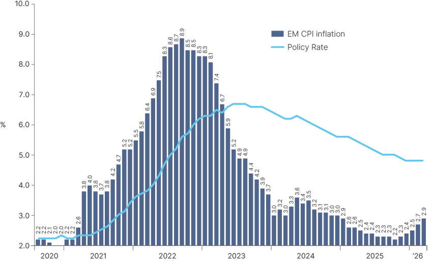
Having front-loaded their tightening cycles, EM inflation dynamics are likely to remain better anchored than in the US. Nevertheless, EM central banks will be cautious and pause their easing cycles (South Africa and likely Mexico), with others such as Brazil proceeding to cut policy rates only gradually. Higher real policy rates and anchored inflation expectations means EM rates give an asymmetry relative to the US.
Should the oil shock tip the global economy into a recession, EM central banks retain significantly more room to cut than their developed market (DM) counterparts, a macro stabiliser that was absent in prior cycles.
Latin American economies, Central Asia and Africa sit with real rates well above neutral and have genuine capacity to ease into any growth slowdown. Within Asia, however, the picture varies. India has high real rates and room to cut, and its domestically-driven economy has outperformed in previous oil shocks despite being a large importer, a scenario which may repeat. Taiwan and Korea have lower real rates, but the structurally low inflation across their economies mean that rising bond yields are likely to reverse there first. Both also benefit from strong tech export cycles that provide a partial growth cushion. China is arguably the least exposed major importer. CPI inflation has been running near zero and policymakers are actively trying to reflate, so a moderate energy cost rise is more likely to be absorbed than to prompt tightening. Also, renewables and coal dominate the energy mix and coal prices are up far less than oil, providing a further structural buffer.
This backdrop explains why we believe interest rates are the first-place investors should look to add exposure. While global equities and credit still discount a high odd of this conflict being short lived, interest rates are discounting a significant inflation spike and a monetary policy reaction function that is unwarranted, in our view. Overnight interest rates swaps are discounting a 50% chance of a 25bps hike by the Fed by September, as well as 75bps hikes by both the ECB and the BOE.
Mexican 1y1y OIS traded close to 8.5% last night before the central bank cut its policy rate by 25bps to 6.75%. Such large gaps have historically emerged when central banks are behind the curve or on the eve of a hiking cycle, not in the middle of one. Similarly, Brazil 1y1y rates widened from 12% to just above 14% since the war started, while Brazil just cut its policy rate by 25bps to 14.75%, in what is likely to be the beginning of an easing cycle. Rates are also buffered by the macro.
Further widening on rates from current levels will tighten financial conditions and precipitate a larger correction in equities and credit. This would increase the likelihood of a sharper economic slowdown, which should on itself cap further interest rates increases, as higher unemployment would force central banks to think about cuts, rather than hikes.
6. Game theory
Much ink has been spilled in the last two weeks framing the game theory behind the current US/Iran conflict. The prevailing narrative is that what started as closer to a 'coercive bargaining' scenario – with the US having asymmetric military capabilities over Iran (US defence is 125x larger than Iran's) – has shifted into something resembling a war of attrition. Both sides are struggling, and neither willing to concede. This is not an uncommon situation; overconfidence among US leaders in their ability to win strategic victories via military might has a long and painful track record, from Iraq and Afghanistan to Vietnam.
From the very beginning of the conflict, we were fully aware of the two key dynamics in the conflict that flag a war of attrition game. First, the Iranian regime has a very high tolerance for pain, given that this war is existential for their system. Even the death of Ayatollah Khomeini and other major Islamic Revolutionary Guard Corp (IRGC) figures seem to have done little to bend their resolve, as the regime is not dependent on a single individual. Second, while Iran has much more limited military resources relative to the US, it does not need to go 'missile for missile' with the US and its allies. Missile and drone strikes in the Gulf countries, including energy assets, and, most importantly, the ability to effectively shut the SoH, is all Iran needs. Even the risk of strikes is enough to deter ships from passing the Strait, and for energy production in the Gulf to be greatly affected.
'Escalation dominance' is an important term in military conflicts. It simply means one side has more options to escalate than the other, and so is more likely to prevail. Neither side has a clear advantage here. The US can attack Iranian energy infrastructure, but Iran can do the same to energy assets, or worse, desalinisation plants, across the Gulf, threatening years of damage to global supply, an unpalatable outcome for the world and US voters alike. A ground invasion to secure Iran's coastline would mean troops in mountainous terrain the enemy knows well, a recipe for asymmetric guerilla warfare. The same applies to seizing Kharg Island, a solution Trump has touted since the 1980s.
Markets tend to underprice the duration of wars of attrition, as they did with Ukraine. This is now becoming a dominant narrative both in the media and the sell side. However, the other game theory scenario relevant here is the 'two-level game', where one or both players face domestic constraints in an external game. For Trump, these are keeping his support base on side into the mid-term elections and his core promise to keep energy prices and inflation low, not to mention his aversion to "forever wars". Having already publicly claimed victory on two of the US military aims, taking out Iranian missile production as well as doing further damage to their nuclear capabilities, the door is open for him to pull back while still saving face.
What is less spoken about, or even totally discounted, is the two-level game Iran's leadership also faces. Iran is not constrained by elections, but the population revolted against the regime just months ago, partly over an economic crisis. After this conflict ends, even under a more overtly militarised state, the IRGC will still need to avoid Iran becoming a failed state with its infrastructure destroyed. Keeping the SoH shut for a prolonged period would therefore be very risky, and even though Iran's rhetoric will likely remain defiant until any deal is struck, its leadership is likely cognisant of this. In our view, these domestic constraints on both sides are the most likely catalyst for a resolution, but the timing remains genuinely uncertain. Left-tail risks remain elevated, particularly as the market is still pricing a resolution sooner rather than later. We would not advise putting too much risk on the table yet, as per our VIX framework.
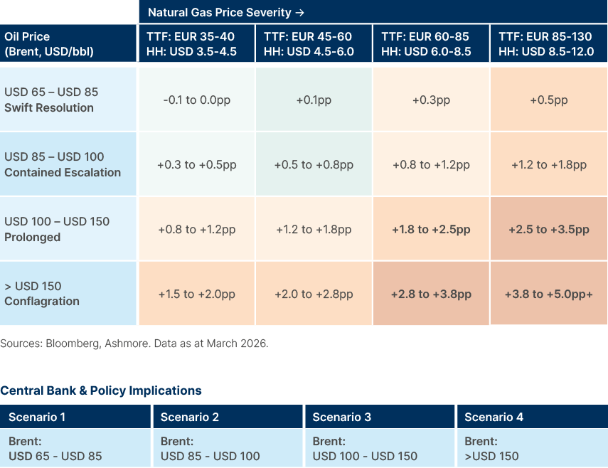
7. Scenario analysis: Current shock and stress test
We stress test global GDP and inflation forecasts against different scenarios for oil and natural gas price increases in Figs 15 and 16. The first two scenarios in the tables, 'swift resolution' and 'contained escalation' would see the Strait of Hormuz open in April, with swift resolution meaning it is fully open, and contained escalation partial opening while the US and Iran are still in active conflict. In the prolonged and 'conflagration' scenarios, the Strait would not open until June, which would lead to an oil shock. The worst-case scenario also entails further severe disruption to energy production capacity across the Gulf, which would lead to a longer-term change in oil and gas supply.
Estimated additions to DM headline CPI are based on IMF World Economic Outlook oil-to-CPI pass-through estimates, ECB staff analysis of energy-to-HICP transmission, and historical precedent (1973-74, 1979-80, 2022). Second-round effects are calibrated to current wage growth trajectories and inflation expectations surveys (University of Michigan, ECB SPF). EM inflation estimates assume partial FX pass-through and reduced subsidy buffers relative to 2022. Central bank reaction functions per published forward guidance as of February 2026.
Fig 15: Global GDP Impact
Estimated change from baseline 2026 global GDP growth (IMF baseline: ~3.2%)
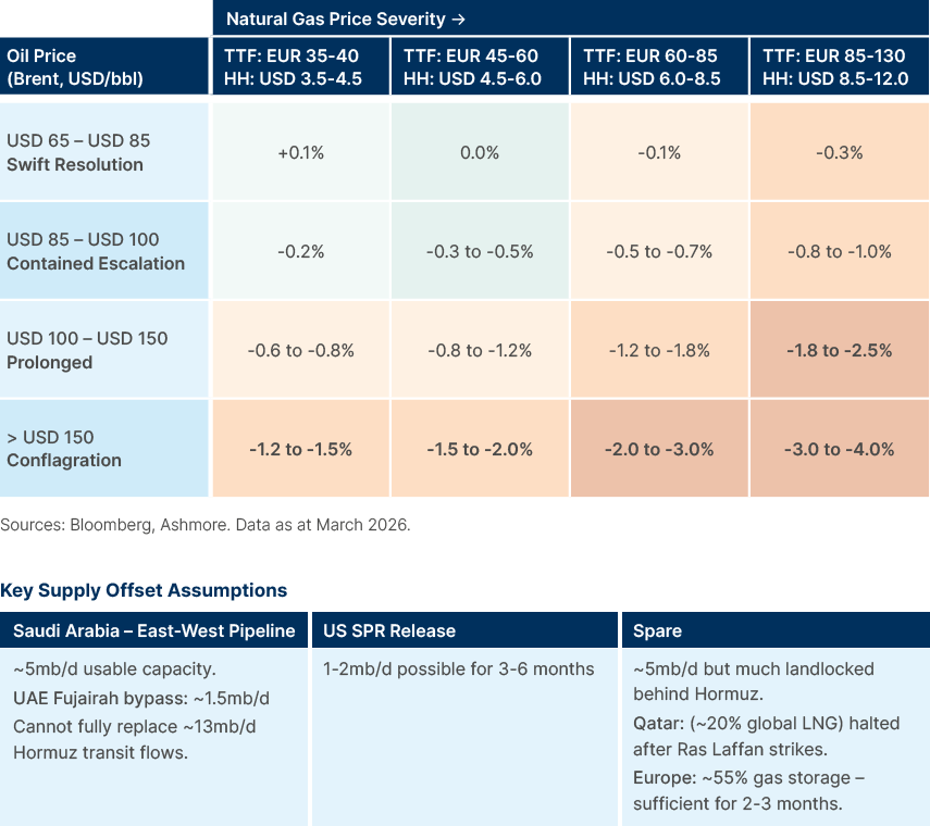
Fig 16: Global Headline CPI Impact
Estimated addition to baseline 2026 DM headline CPI (baseline: ~2.3-2.5% YoY)
Summary and Conclusion
Whether this becomes a full-blown oil shock depends on how long the Strait remains closed and the extent of damage to Gulf energy infrastructure. A resolution within weeks keeps this manageable; months of closure makes it the seventh major oil shock in 75 years. Game theory suggests both sides face domestic constraints that incentivise de-escalation, but tail risks remain elevated and our VIX framework favours patience before adding risk.
If Iran and the US cannot reach a settlement, and an oil shock does materialise, the macro backdrop is far more favourable than 2022. Real rates are positive, inflation expectations anchored, growth is stable and the labour market is soft enough to limit pass-through to wages. If the initial inflation spike turns to a growth shock, the Federal Reserve will have room to cut rates. EM central banks, having front-loaded their tightening, have even more room to ease.
What is already clear is that dispersion across EM assets will be high. For active managers, this is the environment where country and credit selection makes the difference between drawdown and opportunity.
1. The four regimes are determined by the level of growth and inflation against the long-term trend: Goldilocks (growth positive, inflation contained), Boom (both growth and inflation positive), Stagflation (growth weakening, inflation elevated), and Recession (both down).
2. See – Mishkin (2007) Inflation Dynamics, NBER Working Paper 13147, and Bernanke, Gertler & Watson (1997) Systematic Monetary Policy and the Effects of Oil Price Shocks.
3. See – Kilian (2009) Not All Oil Price Shocks Are Alike, American Economic Review.